Radio Group (AI Assistant)
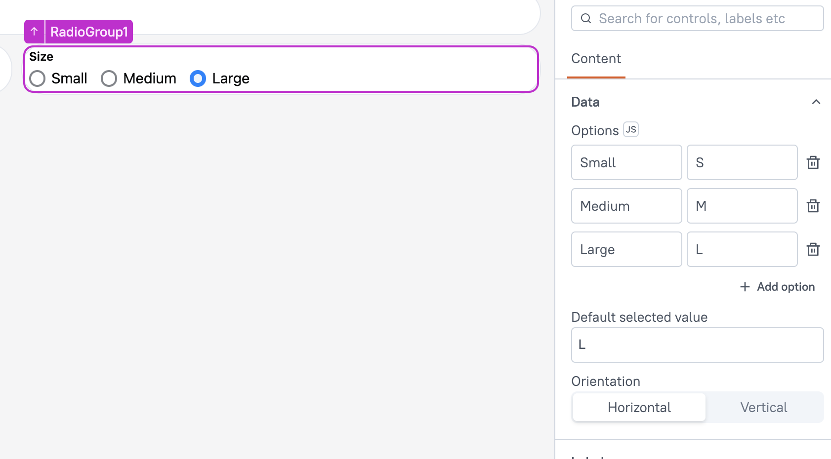
This page provides information on using the Radio Group widget (available in AI Assistant Apps), which allows users to select a single option from a predefined set of choices. It's ideal for scenarios where only one selection is allowed, such as choosing a category, setting a preference, or selecting a payment method.

Content properties
These properties are customizable options present in the property pane of the widget, allowing users to modify the widget according to their preferences.
Data
Defines the options and values for the widget, determining the content displayed to users.
Options array<object>
This property allows you to define the options displayed in the widget by specifying the labels and corresponding values. The values must follow a label-value format, where each label is paired with a unique value. You can either add these options directly via the user interface or use JS to provide them in JSON format.
Example:
[
  {
    "label": "Yes",
    "value": "yes"
  },
  {
    "label": "No",
    "value": "no"
  }
]
You can also dynamically display data by using JavaScript. For instance, you can use the .map() function to transform the data to the desired format, like:
Example:
{{getdata.data.map( p => ({label: p.country, value: p.country}))}}
Default selected value string
This property defines the default option selected in the Radio Group widget. It is mandatory to set a value, and it must match one of the values specified in the Options property.
Label
The Label property is a group of customizable settings that define the main text displayed on the widget.
Text string
Sets the label for the Radio Group widget. This label provides context for the options presented to the user, ensuring clarity about the purpose of the selection.
Tooltip String
Allows you to add a tooltip to the widget, offering additional guidance or context about the selection options. This is particularly useful for clarifying the purpose of the Radio Group or providing instructions for selecting an option.
Validations
Required boolean
When enabled, this property makes the Radio Group a mandatory field. When the Radio Group is placed within a Form widget, enabling the Required property ensures that the Form's submit button remains disabled until the Radio Group has some value.
General
General properties are essential configurations that provide overall control over the widget's behavior and appearance.
Visible boolean
This property controls the visibility of the widget. If you turn off this property, the widget would not be visible in view mode. Additionally, you can use JavaScript by clicking on JS next to the Visible property to conditionally control the widget's visibility.
For example, if you want to make the widget visible only when the user selects "Yes" from a Select widget, you can use the following JavaScript expression:
{{Select1.selectedOptionValue === "Yes"}}
Disabled boolean
This property prevents users from selecting the Checkbox widget. Even though the widget remains visible, user input is not permitted. Additionally, you can use JavaScript by clicking on JS next to the Disabled property to control the widget's disable state conditionally.
For example, if you want to allow only a specific user to interact with the Audio Recorder widget, you can use the following JavaScript expression in the disabled property:
{{appsmith.user.email=="john@appsmith.com"?false:true}}
Animate Loading boolean
This property controls whether the widget is displayed with a loading animation. When enabled, the widget shows a skeletal animation during the loading process. Additionally, you can control it through JavaScript by clicking on the JS next to the property.
Events
Events are properties that allow you to define actions or responses based on user interactions or widget state changes.
onSelectionChange
This event defines the action that would be executed when the user selects or deselects item in the Radio Group. It allows you to specify a list of actions that can be triggered in response to the widget state change.
Reference properties
These properties are not available in the property pane, but can be accessed using the dot operator in other widgets or JavaScript functions. For instance, to get the visibility status, you can use RadioGroup1.isVisible.
options Array
The options property is an array that contains the values of all the available options.
Example:
{{RadioGroup1.options}}
selectedOptionValue string
The selectedValues property holds an array of values that represents the options selected by the user.
Example:
{{RadioGroup1.selectedOptionValue}}
isRequired boolean
This property indicates whether the widget is required or not.
Example:
{{RadioGroup1.isRequired}}
isVisible Boolean
The isVisible property indicates the visibility state of a widget, with true indicating it is visible and false indicating it is hidden.
Example:
{{RadioGroup1.isVisible}}
Methods
Widget property setters enable you to modify the values of widget properties at runtime, eliminating the need to manually update properties in the editor.
These methods are asynchronous and return a Promise. You can use the .then() block to ensure execution and sequencing of subsequent lines of code in Appsmith.
setVisibility (param: boolean): Promise
Sets the visibility of the widget.
Example:
if (SupportRequestForm.requestType === "Critical") {
  RadioGroup1.setVisibility(true);
} else {
  RadioGroup1.setVisibility(false);
}
setDisabled (param: boolean): Promise
Sets the disabled state of the widget.
Example:
if (ProjectDetails.status === "Completed") {
  RadioGroup1.setDisabled(true);
  showAlert("You cannot change the project status after completion.", "warning");
} else {
  RadioGroup1.setDisabled(false);
}
setData (param: array< object >): Promise
Dynamically sets the data for the Radio Group widget. This method updates the widget's options at runtime by accepting an array of objects, where each object contains a label and value key.
Example: If you want to display payment methods:
RadioGroup1.setData([
  { label: "Credit Card", value: "credit_card" },
  { label: "PayPal", value: "paypal" },
  { label: "Bank Transfer", value: "bank_transfer" }
]);